What Were They Thinking?
Pantone is the color authority for many industries and they decide the color of the year. For 2016 they decided to have two colors: pastel pink and pastel blue. They have named the colors Rose Quartz and Serenity (blue).
I admit that I have a bias against putting these two colors together. All I see is baby girl pink and baby boy blue. I had a client whose countertop in her large kitchen were 6″ pink and blue tiles in a checkerboard. It was awful! I also had a friend who had painted her bathroom pastel pink and blue.
The principal difficulty with this color combination arises when there are equal blocks of both colors of the same intensity, or even lack of intensity. That’s when you can’t help but think baby girl and baby boy. It is a combination that is not taken seriously.
According to a Wall Street Journal article, Leatrice Eiseman, the Executive Director of Pantone, is saying that these colors are not for babies and Rose Quartz is not wimpy. Of course, saying it doesn’t make it so. Apparently, the aim was to produce a feeling of compassion. She describes the colors as “inducing feelings of stability, constancy, comfort and relaxation,” and argues that they “create balance in a chaotic world.”
But the soft purplish-blue (Serenity) and nude-pink hues (Rose Quartz) represent a blending and blurring of gender lines, says Ms. Eiseman,“In many parts of the world we are experiencing a gender blur as it relates to fashion, which has in turn impacted color trends throughout all other areas of design,” Eiseman says. “This more unilateral approach to color is coinciding with societal movements toward gender equality and fluidity, the consumer’s increased comfort with using color as a form of expression, a generation that has less concern about being typecast or judged and an open exchange of digital information that has opened our eyes to different approaches to color usage.”
Wow. Who would have thought that pink and blue could reflect so much social change from around the world?
Look. The thought behind the two colors is laudable, but it’s not going to be easy bringing that color combination out of the nursery and into the rest of the home. This type of force-fit is always a stretch, and frequently doesn’t work. Think 1970s “design.”
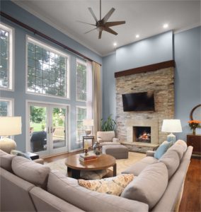
One solution is to have either the pink or the blue dominant with only a hint of the opposite color as an accent. Another idea is to have a mini print of the pink and blue in a tight configuration. This will allow the eye to blend the two colors together and actually provide a purple tone. Both approaches are tricky, so be very careful. A professional interior designer can help a lot.
Whatever color you use for your home, make sure you choose the one that makes you feel comfortable and supported.
Alexander Interiors, Westlake, VA